We build brands that command attention and inspire action.
Buffbunny Collection
Florida Crystals
Coverings


We deliver horizontal creativity.
NOT DEPARTMENTAL SILOS.
CMOs now demand creative solutions across every aspect of their business—from media and commerce to customer experience—not just campaigns. We call this horizontal creativity: applying creative thinking across every facet of your business—from media strategy and commerce optimization to customer experience and campaign execution. Our integrated team ensures insights flow seamlessly between disciplines, creating solutions that work together rather than against each other. When creative thinking spans your entire customer journey, you get breakthrough results instead of fragmented efforts that waste budget and confuse consumers.
We drive profitable revenue growth.
NOT JUST CREATIVE FOR CREATIVE’S SAKE.
Every creative decision starts with a strategic question: will this move the business forward? Our consumer research identifies what actually motivates purchase decisions, not what wins industry recognition. From brand systems to full-funnel campaigns, every element is engineered to drive measurable outcomes—more customers, higher lifetime value, profitable scale. Because when your business grows, we’ve done our job. We focus on crafting strategies that deliver actual results, because pretty campaigns get likes, but performance campaigns pay the bills.
We become part of your team.
NOT A VENDOR YOU MANAGE.
Your dedicated account team lives and breathes your business, providing ongoing updates so you know exactly where things stand. We over-communicate so you’re never left wondering. Need us in your Monday morning leadership meeting? We’re there. Fire to put out at 4 PM? We’re in the trenches with you. Think of us as an extension of your team—with the strategic expertise to help you succeed and the operational excellence to make you look good to your CEO. When something’s urgent for you, it’s urgent for us.
We deliver deliverables.
NOT RETAINERS.
Traditional retainers create a black box where your investment disappears into overhead and time sheets you can’t track. Our deliverable-based model provides radical transparency: defined scope, set pricing, predictable outcomes. You know exactly what you’re buying, what you’ll receive, and when you’ll get it. No hourly padding, no scope creep surprises, no paying for calendar months instead of results. We believe in proving our value with every project, not locking you into long-term contracts. Take back control of your marketing budget and invest in outcomes, not overhead.
Creative that drives revenue
Our creative and performance media strategies have driven $200M+ in revenue for our clients.

Luma and Leaf
Bigeye built Luma and Leaf from concept to complete brand ecosystem—designing everything from packaging to digital strategy—propelling them to become one of America’s fastest-growing clean beauty brands now thriving in over 1,500 retail locations.
Services
Research, Market Intelligence, Brand Strategy, Creative Asset Development, +5

Coverings
Bigeye’s multi-year creative partnership elevated Coverings into the world’s most sophisticated tile and stone industry event, enhancing their brand to match the elegance of the luxury manufacturers they showcase.
Services
Research, Market Intelligence, Brand Strategy, Creative Asset Development, +5

National Mango Board
Bigeye drove double-digit growth for this major consumer brand through comprehensive national campaigns spanning branding, media, retail experiences, and digital strategy that brought mangoes to the forefront of grocery shoppers’ minds across America.
Services
Research, Market Intelligence, Brand Strategy, Creative Asset Development, +5
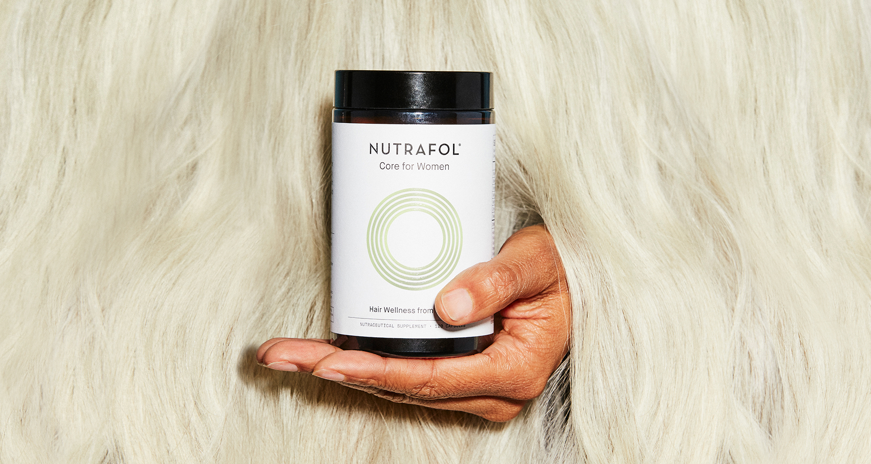
Nutrafol
Bigeye’s creative expertise and strategic design work fueled the explosive growth of one of the most prominent direct-to-consumer success stories in recent years, establishing Nutrafol as a category leader.
Services
Research, Market Intelligence, Brand Strategy, Creative Asset Development, +5

Your growth toolkit
Consumer Research
Data-driven insights that fuel smart business decisions and competitive advantages.
We don’t just collect data, we uncover the “why” behind consumer behavior. After 20+ years and millions of data points, our proprietary research approach delivers the insights that drive profitable growth.
Creative Design
Comprehensive brand solutions that create cohesive, impactful experiences across all touchpoints.
Our services encompass a full range of brand and design solutions. Our Strategy and Messaging practice focuses on brand naming, positioning, strategy, and communications, along with product naming and copywriting.
Media & Performance
Strategic media planning and performance optimization that drives customer acquisition and growth.
We manage comprehensive, full-funnel media services across traditional and digital channels. Our performance marketing expertise spans platforms including Meta, Amazon, Google, YouTube, TikTok, and Pinterest. And yes, we still purchase a lot of out-of-home, TV, radio, and other traditional media too – because sometimes the best strategy is reaching people everywhere they are.
Analytics
Performance measurement and data analysis that drives continuous optimization and market intelligence.
Our analytics capabilities span first-party data analysis and market research to performance tracking and paid media analytics.
Commerce
Comprehensive commerce marketing and advertising solutions for direct-to-consumer and retail brands.
We specialize in commerce-focused marketing strategies that drive sales across all digital touchpoints including 50+ retail media networks. Our expertise spans Amazon advertising and optimization, Shopify marketing campaigns, headless commerce solutions, and social commerce strategies.
EyeQ: Rapid Consumer Intelligence
A monthly insights service that answers your burning marketing questions.
EyeQ delivers fast, actionable consumer insights on a monthly basis – giving you real answers about what drives your customers to buy, what messaging resonates, and where opportunities hide. No more guessing, no more lengthy research timelines. Just rapid, tangible insights that help you make smarter decisions and drive more sales, faster.


