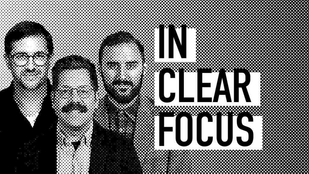
The Bigeye Creative Team joins host Adrian Tennant this week on IN CLEAR FOCUS to discuss creative trends for brands in 2020.
In Clear Focus this week: future directions for creative in 2020 and the decade ahead. Research firm Nielsen has reported that for CPG brands, 49 percent of sales lift from advertising was attributable to the creative. Bigeye team members Dominic Wilson, Erik McGrew, and Nick Hammond discuss what the new decade might mean for visual design and consider the challenges of crafting effective advertising campaigns in a fragmented media landscape.
Episode Transcript
Adrian Tennant: You’re listening to IN CLEAR FOCUS, a unique perspective on the business of advertising. Produced weekly by Bigeye Hello, I’m your host, Adrian Tennant, VP of Insights at Bigeye – an audience-focused, creative-driven, full-service advertising agency. We’re based in Orlando, Florida, but serve clients across the United States and beyond. Thank you for joining us for our first episode of 2020. So this week we’re going to be talking to some of the creative team here at Bigeye about what a new year and a new decade might mean for design in marketing communications. A couple of years ago, the research from Nielsen analyzed over 500 consumer packaged goods brand campaigns that ran on all major media platforms, linear and addressable television, online, digital and video, mobile, magazines, and radio. Nielsen reported that almost half 49% of sales lift from CPG advertising was attributable to the creative. That is ad quality, messaging, and the context of the placement. And in a separate study conducted by the research firm Ipsos for Facebook, creative quality was found to determine 75% of advertising’s impact as measured by brand and ad recall. Joining me here in the studio today are senior multimedia designer, Dominic Wilson; designer, Eric McGrew; and designer Nick Hammond. So guys, let’s kick things off by considering how visual design has changed over the last decade. What are some of the greatest influences on visual design today, say compared to 2010. Erik?
Erik McGrew: I think mobile has been a really big game-changer. I think kind of at the start of the decade it was sort of like an afterthought, you know, the main focus would be on the website and mobile would be great if you had it. I can’t think of a single website that doesn’t have a mobile version or an adaptive or responsive version of it.
Adrian Tennant: Nick?
Nick Hammond: It felt like recently we got into this gradient color gradient thing that everyone’s been doing, which is kind of the next adaptation of flat icons. I also think social had a huge role to play in a lot of it because now anyone can get on and start creating different things and put it out there and someone can see it and iterate on it. And so it feels like the design or art world in general fractured into these multiple different pieces of people putting different aesthetics together and mixing and mashing and it’s moving so quickly because you can see it instantly, and put it up instantly, and iterate on it instantly. Like as a tool that affected what design is.
Adrian Tennant: Right. That’s interesting. So we have Instagram, we have Pinterest accounts. You referenced the availability of online tools – often free. Are we all in some way creatives now?
Nick Hammond: I think everyone’s creative to a degree. And I think as a designer I see it having changed mostly in how I get direction from people. So it feels like you’re kind of getting more direction as a designer.
Adrian Tennant: Erik, have you found that too?
Erik McGrew: You know, everyone’s a creator and that’s great because it’s just more wells of inspiration to draw from. I always find myself going back and forth on how I feel about social because I think that’s great. And on the other hand, certain things can happen. Like Dribble’s a great website. I love going there, like checking out everyone’s work. But I think when you start associating likes to a piece of art, a couple of things can happen. One thing that seems sort of gets a little, I don’t know what the word is, like a little incestuous with like everyone doing the same design now because that’s what’s getting promoted to the front page. And then also just as an artist tying your own self-value to like, “Oh my gosh, this thing only got 20 likes.” I think that can be super detrimental. I find myself doing that a lot. So I think there’s really, really, really great things that social’s done. But I also think there’s kind of the tail end of that, um, is wrapping up like your own value as a creative in what other people have to say about your art.
Adrian Tennant: So commercial photographer Chase Jarvis established CreativeLive and online creative education platform a decade ago and LinkedIn acquired the online software training company, Lynda.com a couple of years ago. Do you use any online resources for your own continuing education? Let’s start with Dom.
Dominic Wilson: I used Lynda in the mid-two thousands but eventually moved on to demos and lectures found on YouTube and Vimeo, in addition to simply just experimenting.
Adrian Tennant: Nick?
Nick Hammond: The way that I think about what being a creative is, it seems like it’s continually being blurred. Where before I would’ve said, “Oh, because I have this experience, I feel like I’m labeling myself as a creative or as a designer,” and with these tools coming out now someone might, you might not see them as a designer or a creative because they’re using a tool as a first step. But you kind of also have to step back and say, “well, who’s to say that they don’t have some other form of thinking that they can bring to the table?”
Adrian Tennant: Erik, your thoughts?
Erik McGrew: I totally agree with that and I think for like a couple thousand dollars and buying a computer, you could teach yourself any of these skills at any of these colleges. I mean, I feel like every day I’m on YouTube or Google, like “how do I do this thing in Illustrator?” And there’s like a minute-and-a-half video that explains it. Yeah, I’m all for education and having it be free and collaborating and talking to people. I’ve worked with people who think they’ve discovered like some trick or like they some style that they kind of like act like a gatekeeper of and they don’t want to show you that how they do it. And I just, I just think that’s crap. Like I’m all about asking how someone did something.
Adrian Tennant: All right. So every year Pantone announces its color of the year, which often influences fashion, home furnishings, and industrial design as well as product packaging and graphic design. In 2017, it was “Greenery” in 2018 “Ultra Violet” and in 2019, “Living coral.” So for 2020, Pantone has selected “Classic Blue.” The website states that, “as technology continues to race ahead of the human ability to process it all, it is easy to understand why we gravitate to colors that are honest and offer the promise of protection, non-aggressive and easily relatable. The trusted Pantone classic blue lends itself to relaxed interaction.” So first of all, what do you think about their choice, Nick?
Nick Hammond: I don’t necessarily ever really follow the Pantone color thing and I always think it’s kinda funny cause we were talking about the design trends thing earlier in it. It feels like to me more of just a marketing thing on their part. They already have kind of a stranglehold on color. I mean the color itself makes sense.
Erik McGrew: Yeah. I mean I think there’s a reason you have these huge companies like social companies like Twitter and Facebook using blue. It’s easy. I have a weird relationship with blue. I think it’s sometimes I struggle with color in general and blue always seems like a cop-out. I’m always like, “Hang on, I wish they would’ve done something cooler.” I always find myself gravitating towards like weird, like ochre colors or like yellows and oranges and I think they’re more interesting.
Adrian Tennant: That’s the influencer part of the Pantone reference. Okay, if you were tasked with selecting the next Pantone color, what would it be and what would be the rationale behind it?
Nick Hammond: I think you’d have to throw a curveball in there and it wouldn’t be a color, it would be multiple colors. I’m not sure if Pantone has done that yet or not. I’m sure they probably have. But to me it’s just very earthy now, you know, and kind of muted and it’s like, that feels like where a lot of it’s going is colors that are a little more subdued and kind of have a vintage retro-y we feel to them.
Adrian Tennant: Okay. So Erik, any advance on multicolor…?
Erik McGrew: I that would be super interesting. I didn’t even think of that. I would love to see like, I think kind of what you said, like a weird orange or like a mustard yellow thrown in there. The psychology of color is such like a weird, interesting thing. And I would love to see if Facebook had to re redesign all their stuff with an orange-based color scheme. Like what would that look like? I’d get weird with it. I don’t know. Something, some weird color
Adrian Tennant: Hmm, Dom?
Dominic Wilson: If you had kind of some hideous color choice, it wouldn’t be more exciting than just some muted pastel.
Adrian Tennant: Right.
Nick Hammond: It’s funny cause I feel like all of our answers to these things are just continually backing up. The idea that design is just fractured into a million different things and it’s you’re breaking the fundamentals of what design is. Ugly colors, weird different type, different structures. It just feels like it’s all over the place.
Adrian Tennant: Let’s talk a little bit about video. Published research found that viewers retain 95% of a message when they watch it in a video compared to just 10% when they read it in text. Last year, $36 billion were invested in video-based digital advertisements. Do you foresee video becoming even more dominant?
Dominic Wilson: Definitely. Those stats you just read confirmed that there are significant opportunities for businesses that haven’t leveraged video and motion graphics, especially in regards to saturating their own social channels and in the digital ad space.
Erik McGrew: A previous job working primarily with like social media stuff and being able to see the numbers. Yeah, there’s, it’s almost like you can’t even compete in the early days. We would throw out not even good videos and they were just outperforming everything. So yeah. And I think that’s why there’s been such a rise with like motion graphics and I think people just want to watch stuff move and you almost get, just can’t compete with it.
Adrian Tennant: Yeah. I think I read somewhere that it’s like 80% of digital revenue ultimately use some form of video. And now we have over-the-top TV as well. Video absolutely is King. So Dom, you’re the senior multimedia designer at Bigeye and you handle most of our video and motion graphics projects. What changes or trends have you seen in motion graphics in recent years?
Dominic Wilson: I’ve noticed that more and more shows, movies, live events, commercials contain three D design elements and a higher level of sophisticated animation. You can see various examples in title sequences, food and beverage products, consumer goods, especially in athletic footwear and automotive. I mean, you no longer have to only rely on live video capture. You showcase what it is you’re trying to promote, which is why you see a demand for highly skilled 3D artists.
Adrian Tennant: Erik, what do you think about typography? Maybe thinking about ads but also products and packaging design.
Erik McGrew: Typography is what I struggle with the most sometimes just because I think it’s such a, I mean it’s a whole world in and of itself. You could spend your entire life just focusing on typography and probably make a living off it. It’s kind of overwhelming and I think it goes back to, you know, everyone has these tools to make their own set of fonts now our what used to be like such a specific art form, anyone can do it now.
Adrian Tennant: How has your own personal design style evolved over the years?
Nick Hammond: Yeah, so my design style had kind of started via looking at more marketing material that was coming out of a lot of clothing brands at the time. So back when I was getting out of high school and into college I had, my whole background was with the apparel industry and I was doing some work for a friend. I had run a paintball apparel company for a while and I was playing competitively. So I was kind of constantly seeing these messaging, these different, I was constantly seeing different forms of messaging that were geared toward younger males. And so it was very aggressive, lots of hard lines, kind of what Dom was talking about with lots of things kind of exploding and hard edges and bright colors and stuff like that. And so I think that’s kinda how I entered what design was. And over the years it’s been more of the process of understanding how to pare it back and get more of that edginess through subtlety rather than hitting you over the face with it. So it feels just a little more of a, uh, kind of coming of age, like putting that into the work and understanding how do you pare back to the thing that makes it feel the most true to what you’re trying to get at instead of just adding, adding, adding. So I think balance, I guess would be what the process has been.
Erik McGrew: If there’s been any change, it’s kind of a stripping away of certain things. I’m trying to be more refined. I struggle with sometimes I get anxiety that I feel like my work is too all over the place. Like again, kind of like coming out of school, you know, you want this nice clean portfolio that looks like everything fits and I don’t have that with my body of work. And I kind of in the past couple of years have like leaned into that and sort of realized that I think that that it’s actually like a strength and it’s been exhausting. But I think I would like, I think I equate it to like I’ve spent the past 10 years collecting all these weird tools that don’t necessarily fit together, but now I have this toolbox of weird tools that I can make things that I personally like, I really enjoy. So it’s been good. So yeah, I think just realizing that maybe having a weird array of different versions of your style can kind of be a string.
Adrian Tennant: So excluding the work you’ve done since you’ve been at Bigeye, what is the most rewarding design project you’ve ever worked on and what made it so?
Erik McGrew: I think mine was, and it wasn’t a big project, I got to design a beer can. Which was kind of like a fun, like a personal goal. Like I’ve always wanted to do that, but we got to work with a brewery out of North Carolina and it was daunting because one thing that made it really great was I got to work with my buddy Michael Forrest who is like next level, but he’s just, he’s incredible. Like I almost want to use the word savant. It’s just he’s such a good person to just talk design with and he’ll say things that I think are like so prolific. And I’m like, “Oh my God, I never would have had that thought.” But working with him was great and we got to design this can for King Canary Brewing. And I said yes to the project and then they sent the style guide over and I realize that this brewery had been branded by these two guys that I’ve looked up to forever. Like, and so then I’m like, “Okay, cool. No pressure. Like I just have to do something that at least is this good.” But it was fun. I think we came up with a really cool canned design and it was just a fun month-long project to work on and it was also just really weirdly rewarding. I think the lesson there is like sometimes it’s those small projects that feel you as a person and the ones that you think are going to be cool and bigger, like where you into the ground and it’s really difficult to get through them.
Adrian Tennant: Nick, have you got a favorite?
Nick Hammond: Yeah, so I did a project with one of my old employers that I was at. They’re called Backcountry.com. They’re kind of like a smaller REI. And when I got in there, we were building out our own in-house private brands team. And so we were responsible for creating a brand, basically, start to finish and kind of working through some of the brands that they had already created and the separations between the two and how you were working to market them toward different demographics. And it was cool because I was able to kind of weave in my background with apparel and help create apparel from start to finish, but also all the marketing around it. And so to me it was incredible to be able to touch pretty much every single endpoint from start to finish of what not only one brand was, but what multiple brands were and watch that go through different segmentation processes and how that was being received and iterate on it. And we were pulling everything in from, you know, social stuff at the time. This was when Instagram video or like the whatever that is, Instagram live stuff had first started coming out. So we were using a lot of that. Yeah. And then traveling across the US on scene on location to do a bunch of video stuff as well. So, yeah, to me that was incredible because it was not only moving fast but you were, you were touching everything and so if you messed up something at one point you would deal with your own difficulties later down the line. And so I think that really gives you an eyeopening perspective of what other people do and how different factors can come into effect. Any number of things in the creative process,
Adrian Tennant: Dom, have you got a favorite?
Dominic Wilson: I had the opportunity within the past year to create and develop a 3D design and dynamics rig for a new admissions look at the Savannah college of art and design. The work was so well received that it was used in their first-ever ad placement in times square in three locations running for a week, which then led to two additional campaigns that ran thereafter. The final approved creative originated from a 3D dynamics rig I had developed three years prior and didn’t really have any use for it at the time. I also use the program called Cinema 4-D, which I was entirely self-taught in. Someone did send back a video of the ads running in the location, which was cool to see.
Adrian Tennant: So where is visual design headed in the decade ahead?
Nick Hammond: Absolutely no idea. It’s wild. It feels like it’s going in a million directions at once and like there are things popping up where people are doing stuff with programs that you never thought they could do. Programs are being pushed. It just feels like there are so many new doors opening and you can’t possibly keep up with all of the doors that are opening. So it’s, you’re just constantly seeing all this crazy stuff and trying to figure out is there something from that that I can pull either – whether that’s a technique or a way of thinking about a project or a solution to a project and yeah, it just feels wild. I personally am interested in when we get to the point where it turns into “Minority Report,” and we have like a full 3D-like room with gloves and all the designers are just creating 3D everything all the time. But I don’t think that’s going to happen for a while.
Erik McGrew: It does feel fractured, like in, you know, what works in print doesn’t necessarily work on social media, which doesn’t necessarily work in the video space. And then even inside social itself, like what works on Facebook doesn’t necessarily is a different tone than what works on Twitter than what works on Instagram. So yeah, I have no idea where it’s heading. I’m excited about where it’s heading. I think I’ve seen illustration really play a huge part in design over the past couple of years and I would love to continue to see it. I think we will probably continue to see illustration grow. Sure, motion graphics are just going to get bigger videos is going to get bigger.
Adrian Tennant: Great discussion guys. Thank you. So design in the decade ahead is going to be a wild ride but we’re happy to go along with it. Okay. Thank you. Thank you to Dominic Wilson.
Dominic Wilson: Yeah, no problem. It was great.
Adrian Tennant: Erik McGrew
Erik McGrew: Thanks for having me.
Adrian Tennant: Nick Hammond
Nick Hammond: Thanks. Hopefully, I get to come back in the future.
Adrian Tennant: You can find links to the resources we discussed on the IN CLEAR FOCUS page at Bigeyeagency.com under “Insights.” Please consider subscribing to the show on Apple podcasts, Spotify, or your favorite podcast player. And if you have an Amazon Echo device, you can use the IN CLEAR FOCUS skill to add the podcast to your Flash Briefing. Thank you for listening to IN CLEAR FOCUS produced Bigeye. I’ve been your host, Adrian Tennant. Until next week, goodbye.
References
- Nielsen Report: Five Keys to Advertising Effectiveness
- Ipsos Report for Facebook IQ: Putting Creative Pre-Testing to the Test
- Pantone Color of the Year: Pantone chooses a classic for its 2020 Color of the Year
- eMarketer: Digital Video Trends for 2020
- Michael Forrest: Counter Brand & Type, Instagram


