Ever taken a moment to really think about the goods and service we use everyday? How about the retail consumer goods package design of the products we embrace most frequently? If you haven’t guessed it, we are a highly visual and emotional species. It’s a hugely interesting exercise to contemplate why we’re driven to make certain purchases, and to have preferences and leanings toward specific brands. Well, the choices we make are due in large part to the look and feel – the tangible presentation elements – of our favorite products, and the emotions they evoke within us as consumers.
[quote]Our product-buying decisions, and a significant portion of that emotional response, come from the invaluable art and science of effective retail consumer goods package design.[/quote]
Our product-buying decisions, and a significant portion of that emotional response, come from the invaluable art and science of effective retail consumer goods package design. Here at BIGEYE, we’ve decided to take a look at some of the most iconic, recognizable retail consumer goods packaging, and what makes each so highly memorable – and hugely popular – among the buying public.
Tiffany & Co
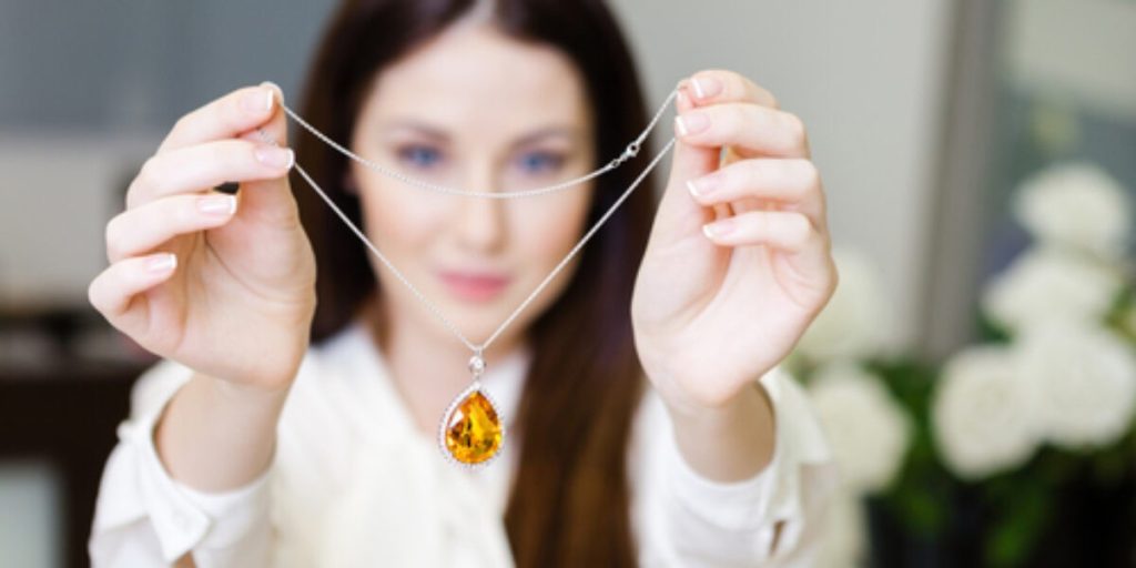
Typically, sales packaging like a box holding a new necklace wouldn’t garner much attention. I, for one, usually rip open a package without any hesitation (or ladylike grace) if I’m expecting some glittery, golden goodies. However, it doesn’t take a novice to note that Tiffany’s robin egg blue box is almost as valuable as the jewelry it contains. The coveted box, wrapped up in a luxe satin ribbon, has inspired wedding decorations, cakes, and centerpieces – the company even has it’s own blue box charm that sells for $250. In fact, empty boxes have even been known to be hot commodities on eBay and Etsy. The distinct color, some say, was chosen because turquoise was a popular jewelry color at the time, although no one is entirely certain of its iconography. In any case, the robin’s egg color (also known as No. 1837, representing the year the company was founded) is instantly identified with Tiffany’s; while the box still says Tiffany & Co., it certainly doesn’t need to. And for those of us who obsess over the origin of specific colors from a design aesthetic, Leatrice Eiseman, executive director of The Pantone Color Institute, says, “It evokes positive thoughts and reactions, and this, combined with the status that Tiffany has assigned to it, makes for perfect packaging.” Our inner-gemologists would tend to agree.
McDonald’s
McDonald’s. Mickey D’s. Nothing seems to instill excitement in a child at dinnertime quite like a McDonald’s Happy Meal box. Perhaps it was because my brother and I were only treated to those tasty chicken nuggets and fries on special occasions (like getting good grades, or when our mother just really didn’t want to bother with dinner), but that feeling of pure joy experienced whilst waiting in the drive-thru line is something that continues to resonate with me today. And the anticipation of knowing there is a prize waiting inside that red and yellow box? That was only half the fun. While the images on the box may change, and the promotional campaigns surrounding the tasty alternatives to mom’s cooking have evolved over time, the feeling it elicits in a child still remains. At BIGEYE, we’re still lovin’ the effective use of retail consumer goods package design for our beloved burger and fries.
[quote]Take a look at how BIGEYE took an established coffee chain, Barnie’s Coffee, and modernized their packaged goods design. [/quote]
Amazon Box
No time for a trip to the mall? Thanks to the juggernaut that is the online shopping phenomenon, our lives have become ever-influenced by the ease and simplicity of making purchases via the wonders of the Internet. As an adult, that same sense of excitement I felt when getting a McDonald’s Happy Meal is now provoked by seeing that distinctive package on my porch. While the price point of my online treasure is surely much higher than a value meal, that doesn’t prevent me from feeling the sheer thrill and delight I experience upon seeing my order arrive on my doorstep. There’s just something different about the Amazon box—and I think others can agree. In fact, the simple cardboard box with the Amazon logo is raved about so enthusiastically on Twitter, you’d think it was the online equivalent of the Tiffany box. Ponder for a moment about how that simple arrow on the side of a basic cardboard package makes you feel all warm and fuzzy inside – and how easily you can return to your computer to make it happen all over again with the few simple clicks of your mouse. Sheer bliss, indeed.
Chanel No. 5
I’m not certain what people are more interested in when purchasing Chanel No. 5: the perfume, or the bottle. The sleek curved glass, single white label, and black sans serif type is modern class at its most exquisite. Beloved for generations, the design is sophisticated, timeless, and has even sparked Chanel to design a plexi-glass clutch version of the iconic bottle. Who wouldn’t want to take a little of Madame Coco – and all her finery – with them as a compliment to their favorite ensemble? Santa, are you listening? I know it’s early, but clearly, the list above covers all my “wish list” items accordingly.
Based upon the examples above alone – and there are so many we’ve left off our list – it’s fairly safe to say that the the power of packaging is far more important than just practical design, although that is certainly necessary, as well. The design needs to speak to the brand advocate’s needs and emotions equally, and directly, in the effective promotion of a product to really illicit the appropriate reaction, and to positively impact buyer behavior. The end result: brand elements that fully support your overarching objectives, and perhaps even attain that iconic status we marketers revere.
Looking for award-winning retail consumer goods package design strategies for your product that will resonate with your target audience? Contact us today to get the conversation started!


