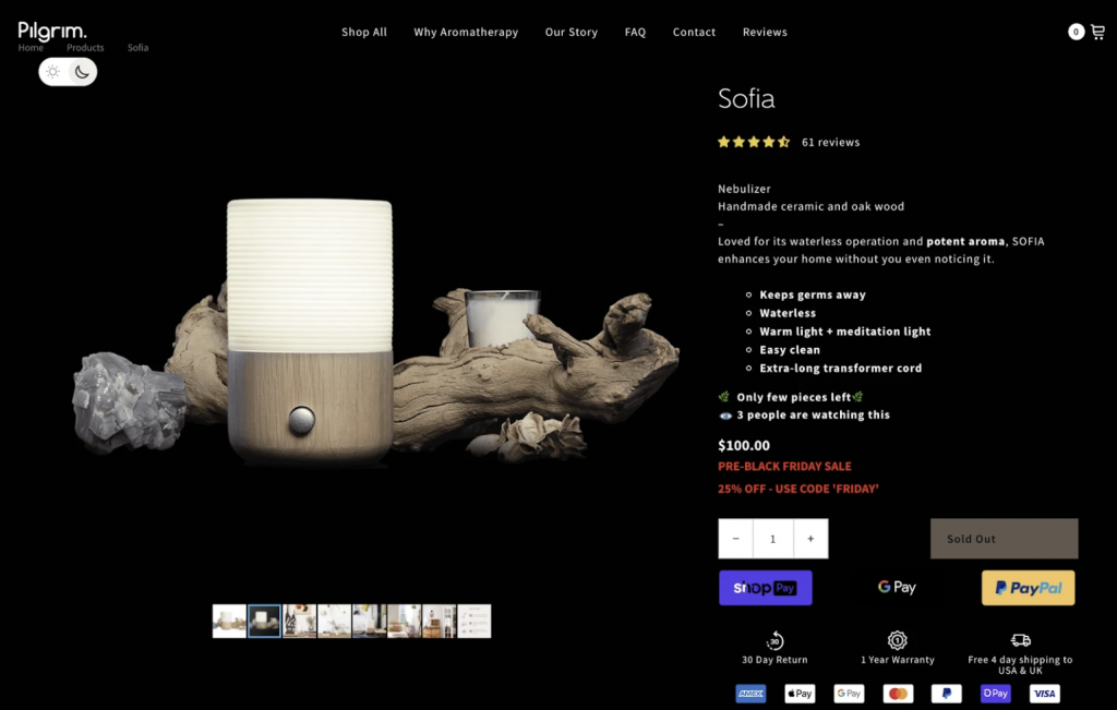
According to a recent BigCommerce analysis, product description pages stand out as the most critical parts of an eCommerce website. They emphasized the fact that designers need to consider their product pages from multiple perspectives:
- Potential customers visit product pages to make buying decisions. Most importantly, the page’s content and design should offer visitors the information they need to click the “Buy” button.
- Many visitors might arrive at these pages directly from search engines, advertisements, and social posts. These prospects might not have ever seen the site’s homepage. In that case, the page needs to function as a landing page and an introduction to the seller.
- The page must also communicate its purpose to the search engine, ad platform, and social media algorithms to increase traffic. SEO represents a critical element of the product page.
Thus, crafting a good eCommerce, Amazon, or Shopify product page design takes some skill. To get started or improve conversions on existing product pages, consider some eCommerce marketing agency do’s and don’ts for product page design.

eCommerce Marketing Agency Tips for Product Page Design
Craft product pages well to increase website traffic and sales. Develop these important pages poorly, and conversions and even search engine traffic will suffer.
The Do’s of Product Description Pages for DTC Marketing
These tips should provide rapid improvement in traffic and conversions:
1.Include customization options with descriptions
Don’t force customers to navigate away from the page to find the color or size product they want to buy. Fewer clicks almost always translate into higher conversions. Use selection boxes or checkboxes to save space. Ideally, design the so choosing different options will also display images to match the selection.
2. Display customer reviews
Online customers almost automatically check for reviews before they risk their money with a new brand. Shoppers want to know how other customers felt about their purchase. Make reviews easy to find.
For one example, FigLeaves sells women’s clothing. According to Neil Patel, adding reviews to product pages increased conversions by 35 percent.
3. Showcase competitive differentiators
Searching online makes it easy for customers to find competing brands. Emphasize features for the product or site that make it a better choice than competitors.
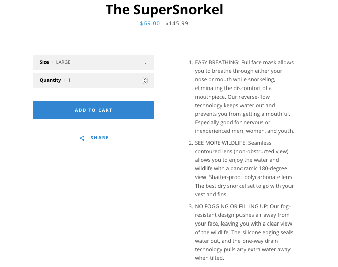
As an example, Neil Patel highlighted a product called a SuperSnorkel. This new type of snorkel retails for considerably more than typical snorkels. The product description lets customers know that the improved product allows breathing through their nose or mouth. Also, the lens doesn’t fog up and offers a 180-degree view. Shoppers can easily see the benefits of buying this product over cheaper alternatives.

Some products might not offer marketers the luxury of providing so many benefits over competitors. As an example, one set of cotton pillowcases might closely resemble another. In that case, high-quality images, various color and size options, and the store’s return and shipping policies may need to work harder to stand out. This also offers marketers a chance to highlight better or more eco-friendly packaging as an advantage.
4. Spell out and update return and shipping policies
Shopify published a study by the Baymard Institute that found extra fees at checkout, including shipping costs, account for over half of abandoned shopping carts. Besides shipping costs, spell out shipping and return policies on the page to reduce customer support issues.
Remember that customer-friendly shipping and return policies can help improve conversions, but surprising customers later with unfavorable policies won’t help. A European eCommerce site for watches called Harloges improved conversions by 41 percent and average sales by six percent when they added their return guarantee to a banner above each product description.
5. Add Multiple Product Images For Various Angles and Options
For example, customers will want to see what a futon or sleeper sofa looks like when it’s folded up or folded out. Some may want to see the back of the sofa as well as the front. If the clothes, furniture, or decor come in different colors, provide high-quality photos of those too. Include other objects or people in the image to help improve visitors’ perspective of size, fit, and what the product might look like when they use it.
The Don’ts of Product Pages for Effective D2C Marketing
Just as an Amazon or Shopify marketing agency should ensure they include all the right things, they will also strive to avoid common mistakes.
1.Focus on too many CTAs
Product pages should help build trust, provide an introduction to a company, and help with search engine optimization. Still, the product page must center around its primary job of selling the product.
Just as product pages stand out as the most crucial part of an eCommerce site, nobody should underestimate the importance of the “Buy” or “Add to Cart” button on the product page.
For instance, Nature Air increased conversions by almost 600 percent after they made the CTA stand out more and added it right next to relevant content.
While page designers should emphasize the product’s CTA, they should resist adding additional calls to action on the page. Keep the customer focused on the sale and worry about enticing them to join a subscription list or anything else after committing to the sale.
2. Don’t compose wordy or hard-to-read descriptions
Crafting product descriptions takes some skill. The text descriptions should include information to satisfy shoppers but not appear wordy or as an unreadable wall of text.
The Shopify blog even mentioned that their customers frequently struggle to find the perfect balance between wordiness and completeness on description pages. An eCommerce strategy professional provided these suggestions for a Shopify product page design:
- Include essential details but otherwise, keep descriptions as short as possible.
- Use headings, bullet points, and paragraph breaks to keep the text readable.
- Supply photos, videos, or other media that can provide more information and appeal to more people.

3. Never forget to optimize product pages for search engines
Perform keyword research and brainstorming to gather the sorts of queries that customers might use to find products. Include the most important and popular keywords and phrases in titles, headings, text, and image captions.
Gather Data and Test for the Best Results
Great product pages start with a good understanding of customers. An eCommerce marketing agency might use surveys, marketing research, and A/B tests to determine how to tweak product pages for the best results. As demonstrated by the examples, some seemingly minor changes can yield significant increases in traffic and conversions.


