This article is part of #TheBigeyeLens series exploring the future of consumer behavior, purchasing decisions, and marketing trends. We’ll be talking about the enduring appeal of Retro Futurism in design.
Call it Retro Futurism, Mid-Century Modern, or California Modern. Picture the clean lines, bold colors, and mixed materials in the buildings and furnishings of an Eishler house or even The Jetson’s home in the fictional Skypad Apartments. See how Walt Disney imagined the future with Tomorrowland, a park opened in 1955.
Basically, Retro Futurism refers to the way prominent artists of the 1930s to 1960s imagined design choices their descendents would make in a generation or two. Their imaginations inspired real-world innovation. Perhaps even more than that, it evoked anticipation that helped people feel more hopeful about the future.
Everything Old is New Again: The Enduring Appeal of Retro Futurism
Surprisingly, a cartoon from the 1960s may provide one of the most well-remembered examples of retro futurism. We may not have flying cars or Rosie the Robot, as The Jetsons promised a generation of hopeful children back then.
Still, these futuristic design trends endured and even started to increase in popularity again in the last few years. For a fun example, look at George Jetson’s favorite seat and video screen from this 60-year-old cartoon. Today, with a wall-mounted TV and a popular style of chair, anybody can recreate this look in their own living room today.
Just Google “George Jetson’s chair” to find plenty of new, real-world examples that replicate this classic seat. With the right apps on a wall-mounted, smart TV, people can even chat with their impatient boss from the chair, like George reluctantly did in several TV episodes. Surprisingly, the creators of The Jetsons even predicted that everything about always-on connectivity in today’s future world isn’t entirely positive.
Did The Jetsons imagine the future or simply inspire it?
Maybe, like the popular song from the 1970s says, “Everything Old is New Again.”

How to Define Retro Futurism in Design
These main characteristics distinguish Retro Futuristic design:
- Form follows function: Despite all the conversation about aesthetics, functionality matters. The product’s unique form or design solves a problem. Obviously, George Jetson found his chair comfortable.
- Designs appear pleasing: People might describe the designs as minimalist, uncluttered, and sleek, with organic or geometric shapes. They appear unique but pleasantly easy on the eyes.
- Objects push material boundaries: Designs often feature less traditional materials or typical materials used in unusual ways. Products tend to explore new uses of wood, plastic, glass, and metal.
- Colors contrast and complement in bold ways: Products often use a bold blend or contrast of materials and colors. Stark black and white, neon, or bright pastels tend to feature heavily in retro futuristic design.
According to The Spruce, nostalgia explains some of the enduring popularity of this kind of design. Even more, lots of people appear to enjoy clean lines, gentle curves, a bold mixture of materials and colors, and the emphasis on minimalism and functionality. Most of all, they help people imagine alternative futures or ones that have just not happened yet. With that, they promise solutions to today’s tough problems.
What Does Retro Futurism Have to do with Consumer Marketing and Advertising?
For consumer marketing, effective advertising positions products as solutions to a problem. Common themes that run through retro futuristism involve discomfort with the present. In its original form, retro futurism offered a bold step towards solutions from the future to resolve this dissatisfaction.
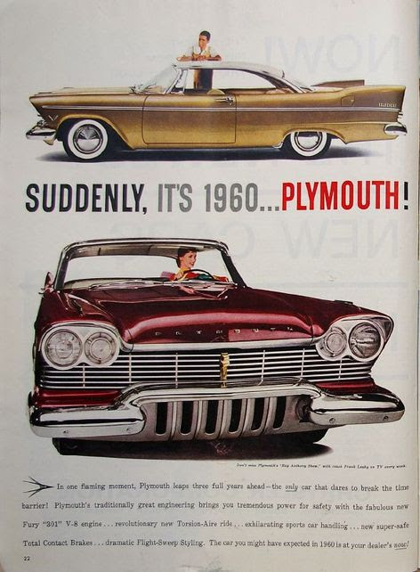
As an example, notice the “suddenly, it’s 1960” advertisement for a 1957 Plymouth on the right. They positioned their cars as advanced when compared to their competitors’ products. Even decades later, people might still anticipate future solutions when viewing retro futurism from the past. After all, AI-powered, robot vacuums work pretty well, but they’re not Rosie the Robot.
Besides visions of a hopeful future, these design trends may also evoke nostalgia, even if they don’t necessarily offer any sort of advanced solution. As an example, look at the cute, new, and very popular microwave from Galanz that reminds people of the style of an old TV. Competitors offer plenty of larger and more powerful microwaves, but they’re not as cute.
Thus, advertisers can use retro futurism in their advertising to plant the idea that their solutions come from the sophisticated tech of the future or even from a simpler past. Either way, the vision inspires hope that the solution will solve a problem.
Leverage Retro Futurism for Consumer Marketing in 2021 and Beyond
Marketers always face challenges when marketing consumer packaged goods. At first glance, one brand of ketchup or coffee may look pretty similar to the next one to an average consumer.
Packaging Strategies mentioned leveraging retro futuristic designs as one of their top advertising trends predicted for this market in 2021. When it comes to CPG marketing, they agreed that retro-inspired design touches can help create an emotional attachment by evoking both feelings of nostalgia and anticipation. They expect lots of neon colors, bold patterns, and other design touches that generate that unique blend of retro and futurism that is retro futurism.
Give Even Serious Topics a Fun Side
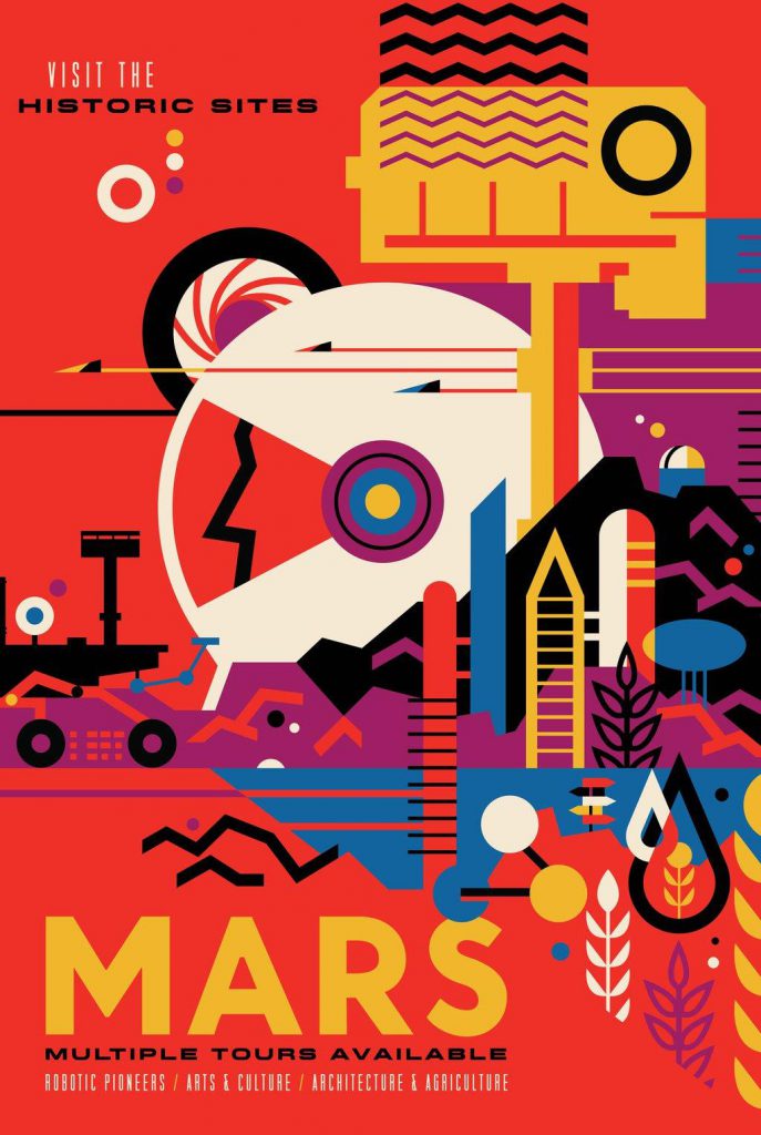
Perhaps most of all, enjoy the process of developing creative designs. Have fun with it. That way, customers and other stakeholders can enjoy it too. For inspiration, look at this lively poster from such a serious organization as Jet Propulsion Laboratory. Nobody believes JPL offers tours of Mars…at least, not yet.
At the same time, JPL says they reference historic sites as a nod to such important missions as Mars Exploration Rovers, Mars Pathfinder, Mars Reconnaisance Orbiter, and Mars Science Laboratory. While the promised tours are fiction today, JPL very seriously anticipates their future reality and hopes the poster helps other people look forward to it too.
Use retro futurism to position products as solutions from the future or the past. Hopefully, every household will have Rosie the Robot one day, just as so many people enjoy smart TVs today. It would be a lot of fun if the actual machine looked more like the one in The Jetsons than like a Roomba. Right now, these design trends can help customers imagine that one brand of ketchup tastes a bit spicier and another brand of coffee can make mornings sweeter.
