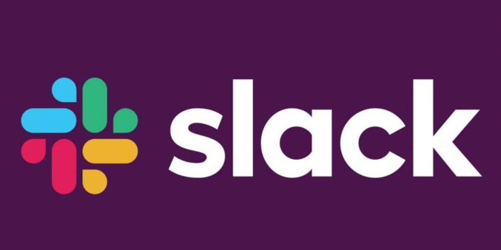
Rebranding an existing brand is no easy feat – especially with a widespread communication tool – jump into our breakdown of Slack’s new logo refresh.
Slack is a corporate collaboration interface. It’s been incredibly successful, growing into an $8 billion company with 8 million daily users in just over 5 years, and now it’s going public. To be more appealing to prospective investors they’ve rebranded, becoming more buttoned-up, sophisticated, and easy to scale. As a marketing research agency, we’re diving into Slack’s rebrand to learn more about these changes, why they were made, and discuss whether we think these changes will be successful… or not.
Let’s start with the practical
Slack’s original design was a colorful hashtag. Sounds pretty simple, but it’s not. Creative services have to scale and apply this logo all over collateral and in its upcoming IPO. Going public means more applications and rapid growth. According to Slack’s blog, the hashtag is made up of 11 different colors and must be placed at exactly 18 degrees off center. If any shading is done incorrectly or it’s placed on a background that isn’t just the right tint of white…well then the whole thing will simply look wrong. That alone is enough to drive any digital marketing agency crazy, but throw in the fact that rapid growth means more differentiated collateral, and it’s more than enough to warrant revisiting the logo.
Using Pentagram as their marketing strategy agency, Slack is repositioning the brand from a fun, playful hashtag to a youthful adult brand. Keeping the logo bright and colorful, they’ve remained young, but moving to a more solid, static, and upright logo does age the brand a bit. To bring back in the hashtag’s lighthearted and lively energy, Slack’s branding agency added what they call “droplets” to mimic the movement and tilted alignment of the original logo.
The difficulty of rebranding
Moving away from the execution, there’s the fact that it’s difficult to rebrand a well-established, public company. Looking to the future, how would an 11-color hashtag age? 10 years from now, would it be an appealing logo? Our web design company is leaning on the side of no. The hashtag is a popular symbol right now, but as time goes on, trends fade. Objectively, a hashtag is not all that aesthetically compelling and the transparency levels throughout this logo can make the whole thing appear too soft.
An important angle to look at is recognition. The new logo is not all that similar to the hashtag. When put right next to each other, it’s easy to understand the progression… but apart? These “droplets” and “lozenges” don’t exactly scream Slack, which is why timing is everything. Yes, Slack is an established brand, but being released in August of 2013, it’s only around 5 years old. As a young brand, in more ways than one, this rebrand is perfectly timed: before going public, where they’d need shareholder approval and after achieving a solid consumer base.
Building a brand foundation
When it comes to branding, it’s not just the symbolism, scalability, and awareness that needs to be considered—there’s also application. Branding needs to be a solid foundation for any company across platforms. As a successful multi-platform media buying agency, we like to explore the implications of redesign across media and devices. A static, non-transparent logo that can be applied on any background is far more effective. The old hashtag could only be posted certain ways on specific collateral due to its incredibly complicated execution, which limits the brand just when it’s about to grow exponentially. This new logo will drive brand awareness and recognition rapidly with the upcoming IPO.
The application applies to more than collateral and static postings. A logo should be dynamic, drawing attention at every single touchpoint. Let’s start with social media marketing services. On every social media platform, your profile has a picture. As far as business pages go, more often than not the logo becomes the profile picture. With how particularly the hashtag has to be placed, this new, much more dynamic logo would make building social pages so much easier.
Building out a video and social, influencers can be indispensable when assisting a rapidly growing brand to extend their reach. From what we’ve seen with our own influencer marketing agency, having the right people, in the right place, saying the right things can make or break your brand growth. As far as this aspect goes, the new branding is definitely the right choice. As mentioned before, the old logo is not easy to post anywhere, and influencers post using your brand aesthetics. The easier your logo, colors, and style are to apply, the more effective your influencers will be.
Mass communications
With the knowledge, we have from our own PR & media relations agency we know that the final PR posts are often not done by the company that has the announcement. This means that the company that is finalizing the post is the one that places the creative. This brings back in the hoops that an agency has to jump through to effectively apply the hashtag logo, the new logo streamlines the communications cycle to get Slack’s brand out there rapidly.
The takeaway
This new branding is a smart move that builds up Slack for long-term sustainability. When it comes to the application of logos, this new design makes life easier on almost all counts. The hashtag lends itself better to placement and collateral creation. This symbol made up of “droplets” and “lozenges” create a mark that is engaging, strong, and unique. Armin Vit from Brand New said it best in his review entitled “Hash it Out”, “It [the new logo] captures the premise of the platform in a more interpretive way than the literal hashtag and, again, it’s simply a good-looking mark.” As far as changing an established, well-recognized brand goes, now is the best time to do it. Once Slack goes public later this year, huge changes like rebranding would have to be approved by the shareholders. Also, this IPO should signify rapid growth, and after there’s widespread recognition for Slack’s logo changing it becomes a less appealing move. Lastly, Slack is young, just over 5 years old, so this redesign won’t hurt its standing much. In planning for widespread branding that lasts, this redesign is the right choice.


